The light is primary
Five fragments for September 2, 2025

Hello from September. September! Today, Kelsey becomes my desk neighbor and the final third of the year kicks off in earnest.
Here are five fragments that stuck with me last week…
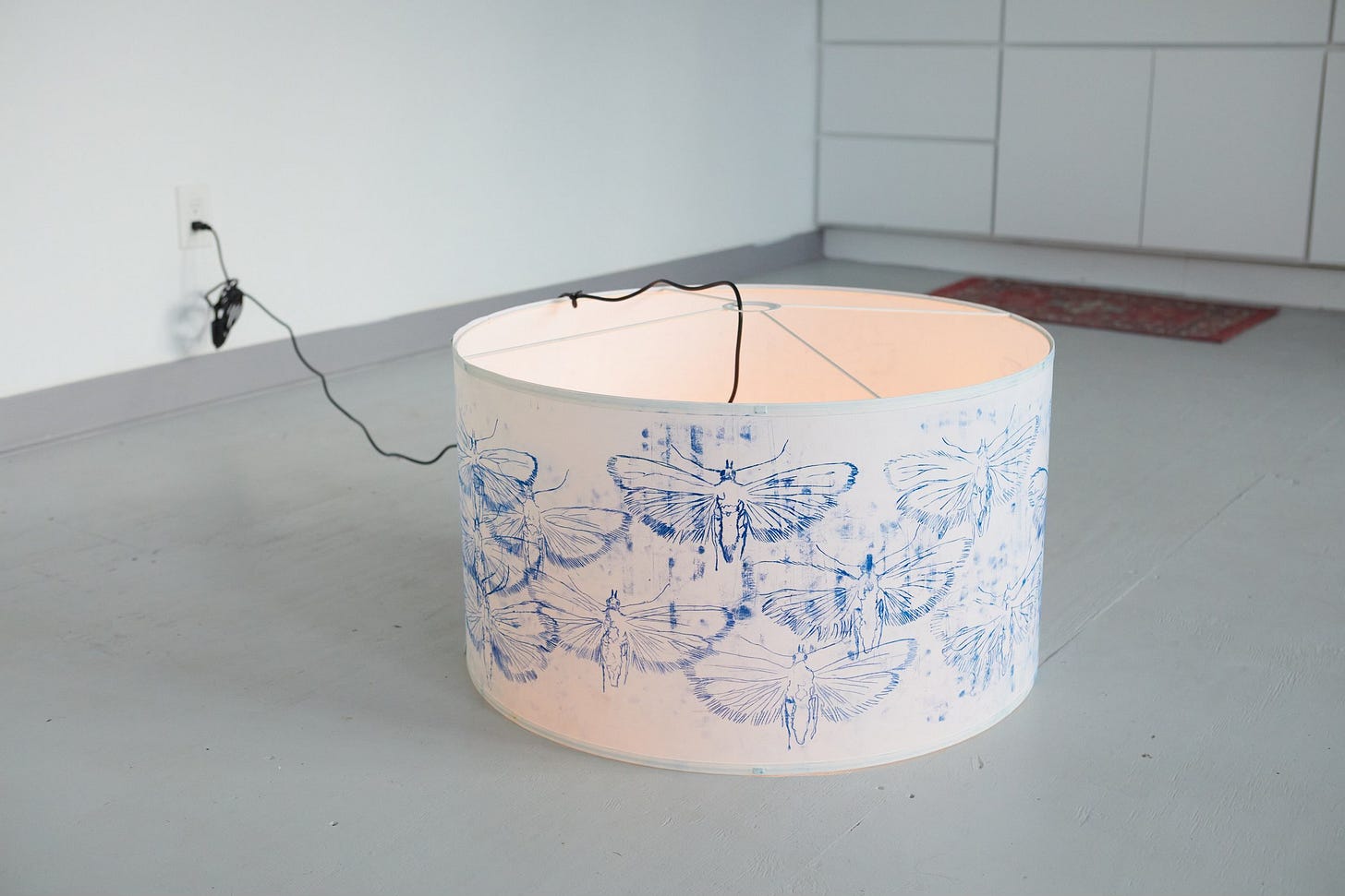
The hyperreal aspects of holography still draw people to it, but I think that the most basic, primitive, pre-verbal, reason for artists is the fact that we are working with light. The light is primary. Having worked with it for a lifetime, for a multiplicity of purposes, I feel that the underlying reason why I am making holograms and not paintings is because they are a purer way of connecting with those early, pre-verbal memories that are experiences of light.
– Margaret Benyon, “Living and working with holography,” presented at the Defining Traditions symposium in 1996. Margaret Benyon was an early hologram artist and someone I’ve returned to again and again over the last few weeks. Her “Tigirl,” from 1985, is haunting.
Most of my prompts are 2000 to 3000 characters long. Most videos I make take about a dozen image prompts and another dozen video prompts and a dozen music prompts. I’m estimating that each video I make uses about 25,000 words to make. That’s wild man. Words are what count these days. Not pixels or polygons. Words!!!
– Ben Nash on X, August 31, 2025. Words!!!
Unfortunately, the same moisture that makes it possible to print the paper in the first place makes it incredibly difficult to print in color with any precision. The damp paper, as it is squeezed and pulled under the high-pressure roller of the press, stretches slightly. Paper stretch makes it impossible to regulate the scale relationship between the matrix and the paper. Normally, in single-pass black-and-white engraving, this doesn’t really matter, although there are some places where it can have enormous, veritably epistemological consequences. In map printing, for example, paper stretch means that the scale of an engraved map becomes inaccurate as soon as it goes through the press. Historically, cartographic copperplates were engraved at a slightly smaller scale than required, so that the map would end up at the proper scale after the paper stretched in the press.
– Jennifer L. Roberts, Contact: Art and the Pull of Print, May 14, 2024. This book is going to end up being a companion for every season. The physicality of print is a useful counterweight to the draw of abstraction.
Finally, we define the gamma or transfer function. You can kind of think of this like an easing curve we apply, that adjusts the brightness of the colors to make the progression seem more natural. This is important because our eyes perceive brightness in a non-linear way, so we need to adjust the colors to match our perception.
– Dan Hollick, design engineer at Tailwind, in “What is a color space,” Making Software. I always enjoy seeing operators write well, and this chapter from Dan’s book-in-progress is really good. I also enjoyed seeing two of my favorite words featured prominently throughout: gamut and gamma.
You don’t “find your style”, as if it’s out there waiting for you. You exhaust all the ways you don’t want to see the world, until only one remains.
– Reuben Wu on X, August 31, 2025. It’s exhausting, but it’s the way.
Until next time,
Diana
https://dianaberlin.com


